Twitter’s recently updated profile design comes replete with long suggested (begged for) features. Included in the upgrade are the abilities to center your profile’s background image, and (in an action that smacks of being Facebook inspired) to create a cover image. Twitter calls it the “Header” image. Buckle up, be you big brands or small, because opportunities abound for those who keep their profiles fresh. We’ve got you covered with some twitter templates, tips and tricks.
Designing for Twitter’s New Profile
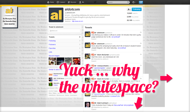
The biggest design change in my opinion is the ability to position your background image either left, right or center. The centered option allows for 9000 times better design implementation. We’re all use to seeing the left justified box of contact info on other brand’s old Twitter profiles. See example. The problem with the old Twitter design was that these were left-aligned and could appear either overlapped or way far away from the actual Twitter content. The new option to center your background image affords users the opportunity to create a picture that will house design content perfectly on 99% of screens. Pre-redesign update, designers had to create for the least common denominator. The dominant screen resolution of visitors would get the best experience, while others…not so much. This left even the most professional brands looking lackluster on larger resolution monitors.
Try Out Our Twitter Profile Templates
We’ve supplied our own Twitter Profile Templates in PSD form to help YOU take advantage of the new design update.
Download Our FREE Twitter Profile TemplatesThe maximum dimensions you can use on Twitter for a background image are 2048 x 2048 pixels. We designed our template to accommodate that resolution, and to work on a centered layout setting. Actual Twitter feed content is fitted into an 865 pixels-wide container, and appears centered on the browser no matter what settings you choose. Twitter gives you the option for the content overlay to be black or white. We recommend that you don’t use heavy patterns, busy images or textual content inside the main content area of the template. Keep it a flat solid color, and then go wild with the rest of the background image space. You could have a cartoon character peeking out from behind the main content, or create an info box (which is overdone if you ask me) adjacent to the main content area. If you have any questions about how to use our handy template, please feel free to reach out to the article author @JoshuaGilmer on Twitter, or use our contact form.
Staying Ahead with Twitter’s Header Image
Aside from the background image, Twitter added a new Header image to profiles. This is vaguely familiar to the cover image available on Facebook via its Timeline upgrade. And like Facebook, this is a completely optional component. However, why would you neglect to use this feature and risk looking outdated to your audience? Twitter suggests the dimensions of 1200 x 600 for the Header image. However, when the design update first rolled out, the suggested minimum resolution was 1252 x 626 pixels. Why the change? We’re not sure. Our research into them matter leads us to believe the original recommended size is best. You may be thinking, the image resolution is very large for the amount of space it will actually occupy on the web page. You’re right. 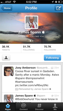 Twitter uses a downsampled version on the website that is only 520 x 260 pixels. However, the larger version is used on the iPad’s retina display, and it is exactly 1252 x 626 pixels there. Don’t forget that the edges will be rounded off on this image.
Mobile Matters
Don’t forget that the same trends for Facebook apply to most every other social network. We’re migrating in droves to mobile experiences over traditional desktop models. Ipso facto, how your Twitter profile looks on a mobile app is important! Twitter has been baked into the operating system of the iPhone for two generations now. The redesign of the profile doesn’t just apply to Twitter’s website, but also takes effect on the iOS app. Users visiting your profile in app will not see your background image, but they do get to see the Header or “cover” image for your brand. The same textual user information is overlayed on the image, but since the screen real estate is smaller on a mobile device, Twitter engineers used the traditional dot navigation element in iOS to elicit users to swipe between content. The user’s profile picture and Twitter handle (username) is on the first panel, and their “About” information (usually a website) with their location is on the second. It should be noted that the second panel receives a dark gradient treatment for one reason or another. This can affect your Twitter design, though marginally (if at all).
Follow Up
If you have any questions on how you can best brand your company or product on Twitter (or even Facebook for that matter), contact us today. One of our staple Social Media Marketing services here at Huebris is Social Media Branding, and we’d be glad to help you strategize a plan that best translates your brand’s motifs into social media spaces.
